 该所有者的项目
(
该所有者的项目
(

:star: Please star this project if you find it useful!
Tubular-React is a Material-UI table (or data grid) with local or remote data-source. Featuring:
- Define a custom layout for columns and cells using
rendermethods. - Use a remote or local datasource. Remote datasource use a specific Request and Response format.
- Sort and filter multiple columns.
- Free-text search of string columns.
- Page data. Remote data is paged in the server side.
- Export data to a CSV file.
- Print data.
You can try a CodeSandbox demo.
Please visit the Tubular GitHub Page to learn how quickly you can start coding. See Related projects below to discover more Tubular libraries and backend solutions.
Table of contents
Installation
$ npm install tubular-react --save
Usages
You can check the documentation of the components at https://unosquare.github.io/tubular/tubular-react
DataGrid
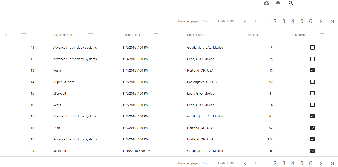
You can start using DataGrid with this sample code. The grid will connect to a remote datasource or have a local datasource depending on what it's passed in the dataSource property.
import React from 'react';
import ReactDOM from 'react-dom';

import { DataGrid } from 'tubular-react';
import { ColumnModel } from 'tubular-common';

const columns = [new ColumnModel('OrderID'), new ColumnModel('CustomerName'), new ColumnModel('ShipperCity')];

const SampleGrid = () => (
    <DataGrid columns={columns} dataSource={'https://tubular.azurewebsites.net/api/orders/paged'} gridName="Grid" />
);

ReactDOM.render(<SampleGrid />, document.getElementById('root'));
This is a preview of the previous code:
Using a remote data source
You will need both a URL and a ColumnModel array.
<DataGrid columns={columns} dataSource={'https://tubular.azurewebsites.net/api/orders/paged'} gridName="Grid" />
Example
You can try a CodeSandbox demo for RemoteDataGrids:

Using a local data source
You will need both an array of data objects and a ColumnModel array. See this example of how to define the array of objects.
<DataGrid columns={columns} dataSource={localData} gridName="Grid" />
Example
You can try a CodeSandbox demo for LocalDataGrid
How to include functionality buttons
You can add functionalities to the DataGridProvider including extra buttons that can perform an action according to your requirements. Just need include an IconButton Component from @material-ui and define the icon or button that you need between DataGridProvider tags and specify the action to perform.
The following snippet shows how to include an Add Button:
import * as React from 'react';
import AddIcon from '@material-ui/icons/Add';
import IconButton from '@material-ui/core/IconButton';
import { DataGrid } from 'tubular-react';

const LocalDataGrid = () => (
    <DataGrid columns={columns} dataSource={'https://tubular.azurewebsites.net/api/orders/paged'} gridName="Grid">
        <IconButton color="default" onClick={() => alert('I can help you to add features to your datagrid.')}>
            <AddIcon />
        </IconButton>
    </DataGrid>
);
Run integrated sample
There is a sample included in this project, you can run it just by doing the following.
// Install all the dependencies
npm install
// Run the sample project
npm start
i18n Support
Tubular React now includes a brand new Language Service that will translate the content of the grid to a preferred language.
Devs can also implement content on their language and import it to use this language.
By default, Tubular React comes with implementations in English and Spanish.
If any key content needs parameters to include in the translation, devs can pass the parameters in the translate function.
import { Lang } from 'tubular-react';

Lang.translate('PageNum', 16);
// => 'Page 16'