 该所有者的项目
(
该所有者的项目
(rc-slider
Slider UI component for React


Screenshots
Features
- Supports IE9, IE9+, Chrome, Firefox & Safari
Install
npm install --save rc-slider
Usage
import React from 'react';
import ReactDOM from 'react-dom';
import Slider, { Range } from 'rc-slider';
// We can just import Slider or Range to reduce bundle size
// import Slider from 'rc-slider/lib/Slider';
// import Range from 'rc-slider/lib/Range';
import 'rc-slider/assets/index.css';

ReactDOM.render(
  <div>
    <Slider />
    <Range />
  </div>,
  container
);
API
createSliderWithTooltip(Slider, Range) => React.Component
An extension to make Slider or Range support Tooltip on handle.
const Slider = require('rc-slider');
const createSliderWithTooltip = Slider.createSliderWithTooltip;
const Range = createSliderWithTooltip(Slider.Range);
After Range or Slider was wrapped by createSliderWithTooltip, it will have the following props:, Name, Type, Default, Description, ------------, -------, -------, -----------, tipFormatter, (value: number): React.ReactNode, value => value, A function to format tooltip's overlay, tipProps, Object, { placement: 'top', prefixCls: 'rc-slider-tooltip', overlay: tipFormatter(value) }, A function to format tooltip's overlay, ### Common API
The following APIs are shared by Slider and Range., Name, Type, Default, Description, ------------, -------, -------, -----------, className, string, '', Additional CSS class for the root DOM node, min, number, 0, The minimum value of the slider, max, number, 100, The maximum value of the slider, marks, {number: ReactNode} or{number: { style, label }}, {}, Marks on the slider. The key determines the position, and the value determines what will show. If you want to set the style of a specific mark point, the value should be an object which contains style and label properties., step, number or null, 1, Value to be added or subtracted on each step the slider makes. Must be greater than zero, and max - min should be evenly divisible by the step value. When marks is not an empty object, step can be set to null, to make marks as steps., vertical, boolean, false, If vertical is true, the slider will be vertical., handle, (props) => React.ReactNode, A handle generator which could be used to customized handle., included, boolean, true, If the value is true, it means a continuous value interval, otherwise, it is a independent value., reverse, boolean, false, If the value is true, it means the component is rendered reverse., disabled, boolean, false, If true, handles can't be moved., dots, boolean, false, When the step value is greater than 1, you can set the dots to true if you want to render the slider with dots., onBeforeChange, Function, NOOP, onBeforeChange will be triggered when ontouchstart or onmousedown is triggered., onChange, Function, NOOP, onChange will be triggered while the value of Slider changing., onAfterChange, Function, NOOP, onAfterChange will be triggered when ontouchend or onmouseup is triggered., minimumTrackStyle, Object, please use trackStyle instead. (only used for slider, just for compatibility , will be deprecate at rc-slider@9.x ), maximumTrackStyle, Object, please use railStyle instead (only used for slider, just for compatibility , will be deprecate at rc-slider@9.x), handleStyle, Array[Object] , Object, [{}], The style used for handle. (both for slider(Object) and range(Array of Object), the array will be used for multi handle following element order), trackStyle, Array[Object] , Object, [{}], The style used for track. (both for slider(Object) and range(Array of Object), the array will be used for multi track following element order), railStyle, Object, {}, The style used for the track base color., dotStyle, Object, {}, The style used for the dots., activeDotStyle, Object, {}, The style used for the active dots., ### Slider, Name, Type, Default, Description, ------------, -------, -------, -----------, defaultValue, number, 0, Set initial value of slider., value, number, -, Set current value of slider., startPoint, number, undefined, Track starts from this value. If undefined, min is used., tabIndex, number, 0, Set the tabIndex of the slider handle., ariaLabelForHandle, string, -, Set the aria-label attribute on the slider handle., ariaLabelledByForHandle, string, -, Set the aria-labelledby attribute on the slider handle., ariaValueTextFormatterForHandle, (value) => string, -, A function to set the aria-valuetext attribute on the slider handle. It receives the current value of the slider and returns a formatted string describing the value. See WAI-ARIA Authoring Practices 1.1 for more information., ### Range, Name, Type, Default, Description, ------------, -------, -------, -----------, defaultValue, number[], [0, 0], Set initial positions of handles., value, number[], Set current positions of handles., tabIndex, number[], [0, 0], Set the tabIndex of each handle., ariaLabelGroupForHandles, Array[string], -, Set the aria-label attribute on each handle., ariaLabelledByGroupForHandles, Array[string], -, Set the aria-labelledby attribute on each handle., ariaValueTextFormatterGroupForHandles, Array[(value) => string], -, A function to set the aria-valuetext attribute on each handle. It receives the current value of the slider and returns a formatted string describing the value. See WAI-ARIA Authoring Practices 1.1 for more information., count, number, 1, Determine how many ranges to render, and multiple handles will be rendered (number + 1)., allowCross, boolean, true, allowCross could be set as true to allow those handles to cross., pushable, boolean or number, false, pushable could be set as true to allow pushing of surrounding handles when moving a handle. When set to a number, the number will be the minimum ensured distance between handles. Example: 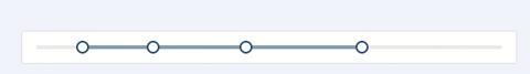 , ## Development
npm install
npm start
Example
npm start and then go to http://localhost:8005/examples/
Online examples: http://react-component.github.io/slider/
Test Case
http://localhost:8005/tests/runner.html?coverage
Coverage
http://localhost:8005/node_modules/rc-server/node_modules/node-jscover/lib/front-end/jscoverage.html?w=http://localhost:8088/tests/runner.html?coverage
License
rc-slider is released under the MIT license.