react-date-range


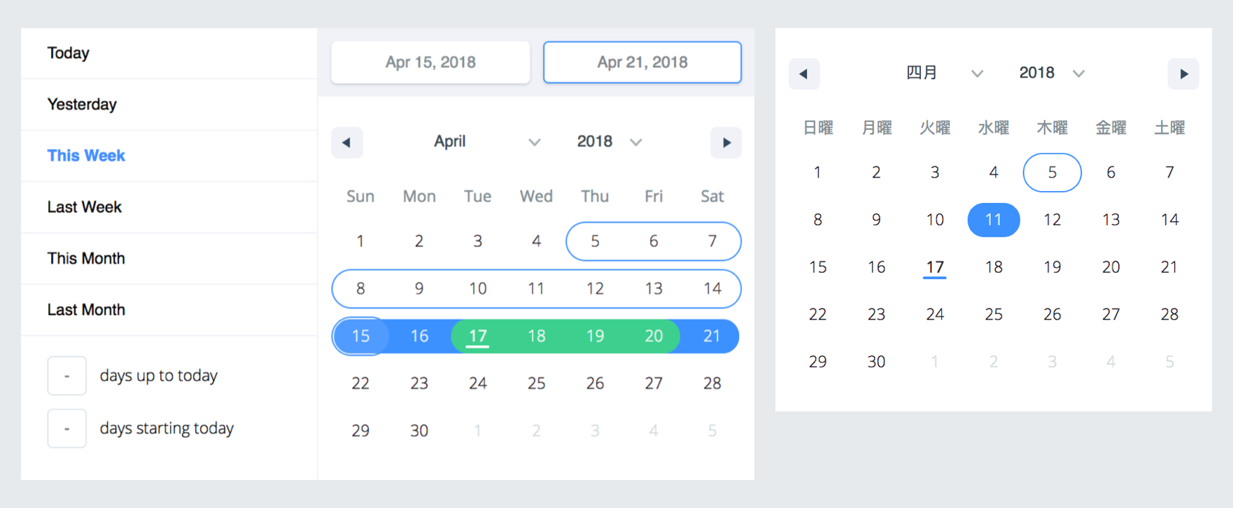
A date library agnostic React component for choosing dates and date ranges. Uses date-fns for date operations.
Why should you use react-date-range?
- Stateless date operations
- Highly configurable
- Multiple range selection
- Based on native js dates
- Drag n Drop selection
- Keyboard friendly
Live Demo : http://adphorus.github.io/react-date-range
Getting Started
Installation
yarn add react-date-range
If you don't use yarn
npm install --save react-date-range
Usage
You need to import skeleton and theme styles first.
import 'react-date-range/dist/styles.css'; // main style file
import 'react-date-range/dist/theme/default.css'; // theme css file
DatePicker
import { Calendar } from 'react-date-range';

class MyComponent extends Component {
  handleSelect(date){
    console.log(date); // native Date object
  }
  render(){
    return (
      <Calendar
        date={new Date()}
        onChange={this.handleSelect}
      />
    )
  }
}
DateRangePicker / DateRange
import { DateRangePicker } from 'react-date-range';

class MyComponent extends Component {
  handleSelect(ranges){
    console.log(ranges);
    // {
    //   selection: {
    //     startDate: [native Date Object],
    //     endDate: [native Date Object],
    //   }
    // }
  }
  render(){
    const selectionRange = {
      startDate: new Date(),
      endDate: new Date(),
      key: 'selection',
    }
    return (
      <DateRangePicker
        ranges={[selectionRange]}
        onChange={this.handleSelect}
      />
    )
  }
}
Options
Property, type, Default Value, Description
-------------------------------------, -----------, ------------------, -----------------------------------------------------------------
locale, Object, enUS from locale, you can view full list from here. Locales directly exported from date-fns/locales.
className, String, wrapper classname
months, Number, 1, rendered month count
showSelectionPreview, Boolean, true, show preview on focused/hovered dates
showMonthAndYearPickers, Boolean, true, show select tags for month and year on calendar top, if false it will just display the month and year
rangeColors, String[], defines color for selection preview.
shownDate, Date, initial focus date
minDate, Date, defines minimum date. Disabled earlier dates
maxDate, Date, defines maximum date. Disabled later dates
direction, String, 'vertical', direction of calendar months. can be vertical or horizontal
disabledDates, Date[], [], dates that are disabled
scroll, Object, { enabled: false }, infinite scroll behaviour configuration. Check out Infinite Scroll section
showMonthArrow, Boolean, true, show/hide month arrow button
navigatorRenderer, Func, renderer for focused date navigation area. fn(currentFocusedDate: Date, changeShownDate: func, props: object)
ranges, *Object[], [], Defines ranges. array of range object
moveRangeOnFirstSelection(DateRange), Boolean, false, move range on startDate selection. Otherwise endDate will replace with startDate.
onChange(Calendar), Func, callback function for date changes. fn(date: Date)
onChange(DateRange), Func, callback function for range changes. fn(changes). changes contains changed ranges with new startDate/endDate properties.
color(Calendar), String, #3d91ff, defines color for selected date in Calendar
date(Calendar), Date, date value for Calendar
showDateDisplay(DateRange), Boolean, true, show/hide selection display row. Uses dateDisplayFormat for formatter
onShownDateChange(DateRange,Calendar), Function, Callback function that is called when the shown date changes
initialFocusedRange(DateRange), Object, Initial value for focused range. See focusedRange for usage.
focusedRange(DateRange), Object, It defines which range and step are focused. Common initial value is [0, 0]; first value is index of ranges, second one is which step on date range(startDate or endDate).
onRangeFocusChange(DateRange), Object, Callback function for focus changes
preview(DateRange), Object, displays a preview range and overwrite DateRange's default preview. Expected shape: { startDate: Date, endDate: Date, color: String }
showPreview(DateRange), bool, true, visibility of preview
editableDateInputs(Calendar), bool, false, whether dates can be edited in the Calendar's input fields
dragSelectionEnabled(Calendar), bool, true, whether dates can be selected via drag n drop
onPreviewChange(DateRange), Object, Callback function for preview changes
dateDisplayFormat(DateRange), String, MMM D, YYYY, selected range preview formatter. Check out date-fns's format option
renderStaticRangeLabel(DefinedRange), Function, Callback function to be triggered for the static range configurations that have hasCustomRendering: true on them. Instead of rendering staticRange.label, return value of this callback will be rendered.
staticRanges(DefinedRange, DateRangePicker), Array, default preDefined ranges, -
inputRanges(DefinedRange, DateRangePicker), Array, default input ranges, -
*shape of range:
 {
   startDate: PropTypes.object,
   endDate: PropTypes.object,
   color: PropTypes.string,
   key: PropTypes.string,
   autoFocus: PropTypes.bool,
   disabled: PropTypes.bool,
   showDateDisplay: PropTypes.bool,
 }
Infinite Scrolled Mode
To enable infinite scroll set scroll={{enabled: true}} basically. Infinite scroll feature is affected by direction(rendering direction for months) and months(for rendered months count) props directly.
If you prefer, you can overwrite calendar sizes with calendarWidth/calendarHeight or each month's height/withs with monthWidth/monthHeight/longMonthHeight at scroll prop.
  // shape of scroll prop
  scroll: {
    enabled: PropTypes.bool,
    monthHeight: PropTypes.number,
    longMonthHeight: PropTypes.number, // some months has 1 more row than others
    monthWidth: PropTypes.number, // just used when direction="horizontal"
    calendarWidth: PropTypes.number, // defaults monthWidth * months
    calendarHeight: PropTypes.number, // defaults monthHeight * months
  }),
TODOs
- Make mobile friendly (integrate tap and swipe actions)
- Add complex booking customization example with exposed dayRenderer prop
- Add tests
- Improve documentation