 projecs by owner
(
projecs by owner
(RNParallax (react-native-parallax-header)


- A react native scroll view component with Parallax header :p
- Inspired by GitHub - jaysoo/react-native-parallax-scroll-view
- Code is based on React Native ScrollView animated header – App & Flow – Medium and added little customisation :p
Installation
$ npm i react-native-parallax-header --save
Demo
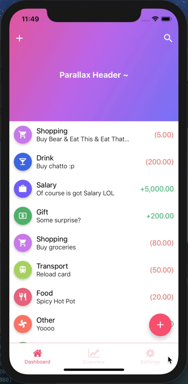
iPhone X or XS (Using alwaysShowTitle={false} & alwaysShowNavBar={false})
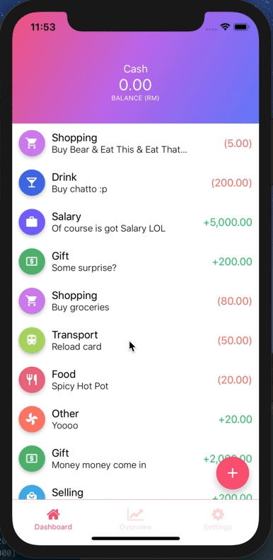
iPhone X or XS
iPhone 8

Example
import Icon from 'react-native-vector-icons/MaterialIcons';
import ReactNativeParallaxHeader from 'react-native-parallax-header';

const IS_IPHONE_X = SCREEN_HEIGHT === 812, SCREEN_HEIGHT === 896;
const STATUS_BAR_HEIGHT = Platform.OS === 'ios' ? (IS_IPHONE_X ? 44 : 20) : 0;
const HEADER_HEIGHT = Platform.OS === 'ios' ? (IS_IPHONE_X ? 88 : 64) : 64;
const NAV_BAR_HEIGHT = HEADER_HEIGHT - STATUS_BAR_HEIGHT;

const images = {
  background: require('../img/test.jpg'), // Put your own image here
};

const styles = StyleSheet.create({
  container: {
    flex: 1,
  },
  contentContainer: {
    flexGrow: 1,
  },
  navContainer: {
    height: HEADER_HEIGHT,
    marginHorizontal: 10,
  },
  statusBar: {
    height: STATUS_BAR_HEIGHT,
    backgroundColor: 'transparent',
  },
  navBar: {
    height: NAV_BAR_HEIGHT,
    justifyContent: 'space-between',
    alignItems: 'center',
    flexDirection: 'row',
    backgroundColor: 'transparent',
  },
  titleStyle: {
    color: 'white',
    fontWeight: 'bold',
    fontSize: 18,
  },
});

renderNavBar = () => (
  <View style={styles.navContainer}>
    <View style={styles.statusBar} />
    <View style={styles.navBar}>
      <TouchableOpacity style={styles.iconLeft} onPress={() => {}}>
        <Icon name="add" size={25} color="#fff" />
      </TouchableOpacity>
      <TouchableOpacity style={styles.iconRight} onPress={() => {}}>
        <Icon name="search" size={25} color="#fff" />
      </TouchableOpacity>
    </View>
  </View>
)

render() {
  return (
    <View style={styles.container}>
      <ReactNativeParallaxHeader
        headerMinHeight={HEADER_HEIGHT}
        headerMaxHeight={250}
        extraScrollHeight={20}
        navbarColor="#3498db"
        title="Parallax Header ~"
        titleStyle={styles.titleStyle}
        backgroundImage={images.background}
        backgroundImageScale={1.2}
        renderNavBar={this.renderNavBar}
        renderContent={this.renderContent}
        containerStyle={styles.container}
        contentContainerStyle={styles.contentContainer}
        innerContainerStyle={styles.container}
        scrollViewProps={{
          onScrollBeginDrag: () => console.log('onScrollBeginDrag'),
          onScrollEndDrag: () => console.log('onScrollEndDrag'),
        }}
      />
    </View>
  );
}